Tuesday, 10 May 2011
Friday, 1 April 2011


Thursday, 31 March 2011
So we've finally started to plan for our own music magazines and here are my drawn up plans of the front cover, contents page and double page spread.
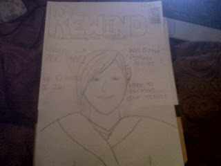

 The genre for my magazine is indie music. I decided to feature a character called Zoe Mac. The colour scheme for my magazine will be red, white and black. I decided this because they are quite simple colours that go together. Those colours also arent pointed towards a certain gender. Those colour will be used throughout the cover, contents page and double page spread so that the magazine is consistent. That will be the same for the font which i chose to be quite unique to suit my genre of indie music. My double page spread will be all about the character Zoe Mac. There will be an interview all about her upcoming album.


Wednesday, 30 March 2011
Mixmag Magazine Analysis

I think Mixmag magazine is all about dance and clubbing music which is usually played at raves and parties. I think this because of several reasons including the images and colours used and the content of the magazine.
The image on the front of the magazine is of a man with a blue lined background behind him. The background makes it seem as if the man is in his own little world which is usually the cae with people at clubs and raves who are often doing drugs and/or drinking alcohol.
The colour used on the magazine colour are very bright and stand out alot on top of the dark blue background. The colours are very 'in your face' which is just what clubbing and dance music is like.
The coverlines are very obvious to point out the genre of music such as: 'who parties harder', 'best underground rave', 'free party spirit' and 'return to rave'.
This is what I think the audience profile is for mixmag:
Age: 16-25
Sex: male and femaleClass: C1/C2
I think the target audience is people aged 16-25. I think this because that is the age when teenagers and young adults start to rebel against things by going out to parties and doing drugs/drinking alcohol. Also it mentions Ibiza in one of the coverlines. Ibiza is a place where many young people choose to go on holiday and is known to have raves and foam parties there.
The model in the image is around 20 years old. The younger end of my target audience (16) would buy the magazine becaue they want to be like the model who is older than them and looks like he is having fun because he can legally do things like drink alcohol etc.
Contents Page

This is the finished copy of the contents page for my school magazine.
I used the same colours for the contents page as I did for the front cover to make sure the magazine was consistent.
The improvements I would make for my school magazine contents page would be to change the colour scheme to red and yellow to fit the schools colours. I would also use different images. I used the same images on both the contents page and front cover so using different ones would make it more interesting to the reader.
School Magazine
This is the finished copy of the front cover for the school magazine that I designed.

The colour I chose for the background I a light blue. I chose this because it’s a bright colour which I thought would attract people to read the magazine. I also made it that colour so I could blend it in with the colour of the sky on the image so the magazine cover wouldn’t put to ‘put together’.
I chose the image of the school ground because it is relevant and I thought it would represent the school well. It makes people see the school as a clean, bright, happy and peaceful place to be. I had to edit the photo quite a bit on Photoshop to get it that way a originally the background of the image was very cloudy and looked quite miserable.
To improve the front cover of my school magazine I would change the colours. I would make the colours red and yellow because they are the schools colours so it would look more like it was made for St Marks school and not just any magazine. I would also put another image on there and a few more cover lines to make it look more busy as I think it looks quite plain. I would also include the fact that it is a free magazine to attract more people to read it.
School Magazine
For our next assignment in preparation for making our own music magazine we had to design and create the front cover and contents page for a school magazine. Here are my planning page for it.
Front Cover
 Contents Page

Front Cover


Subscribe to:
Comments (Atom)